Reluctance to spend
Users preferred promo credits over depositing their own money.
Onboarding Redesign · Case Study
Redesigned onboarding to cut first-hour churn by 19.8% and get new players to their first win faster.
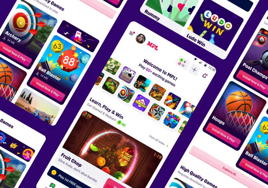
01/Overview & Role
Nearly half of new users left before reaching the fun.
I reframed the entire experience around one goal: a new user's first win in under 90 seconds.
02/Problem & Research
Nearly half of new users left within the first hour.
Insight 01
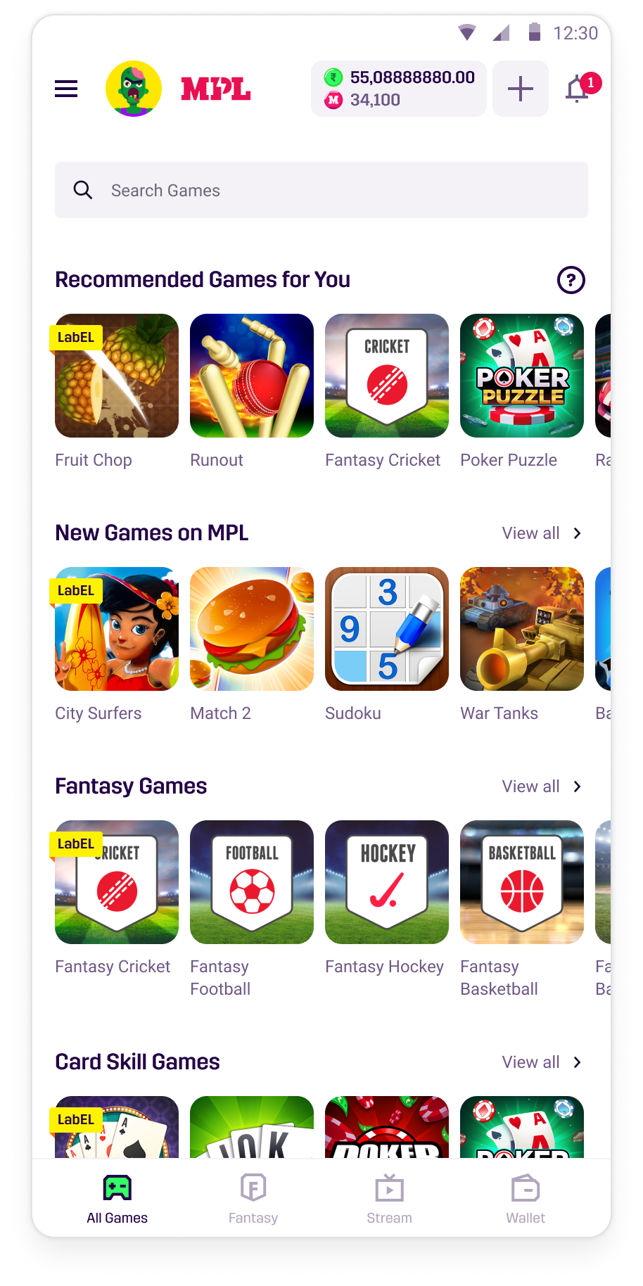
First-time experience of the app
Endless game rows gave first-time users no clear place to start.
Insight 02
Bombarded with pop-ups
Offers, missions, reward toasts, and ads buried the games before users could act.
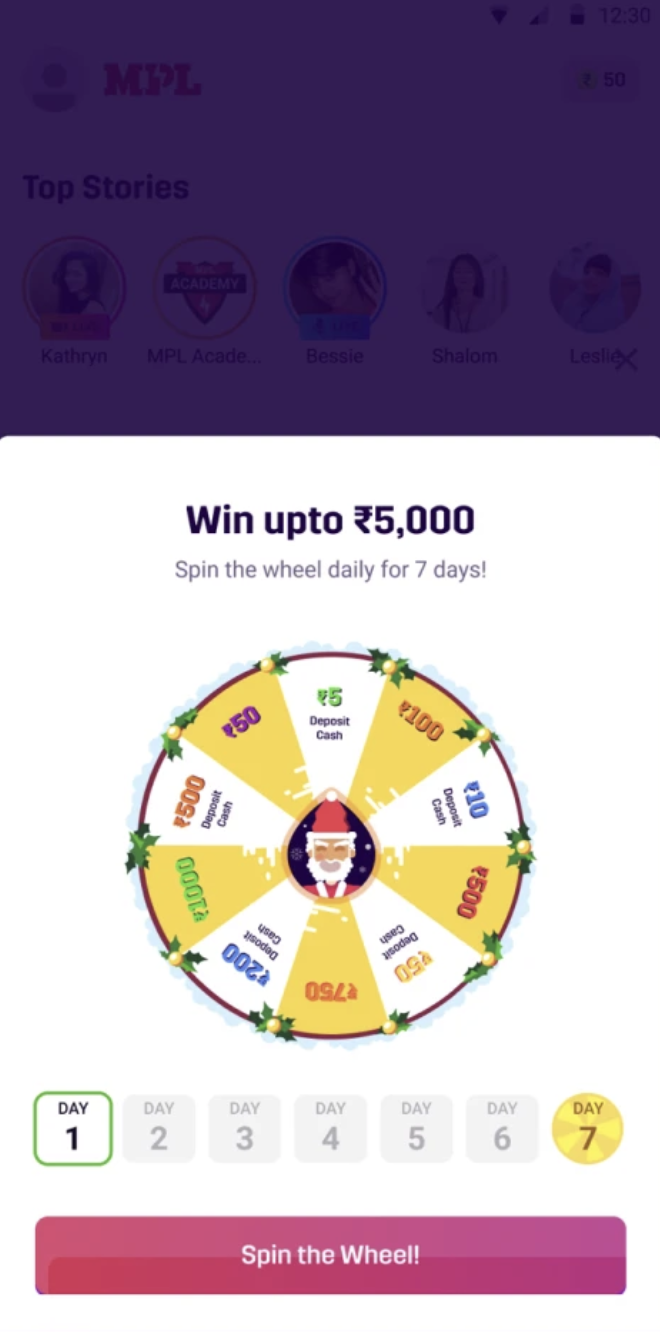 Spin-the-wheel offer covering the Top Stories feed
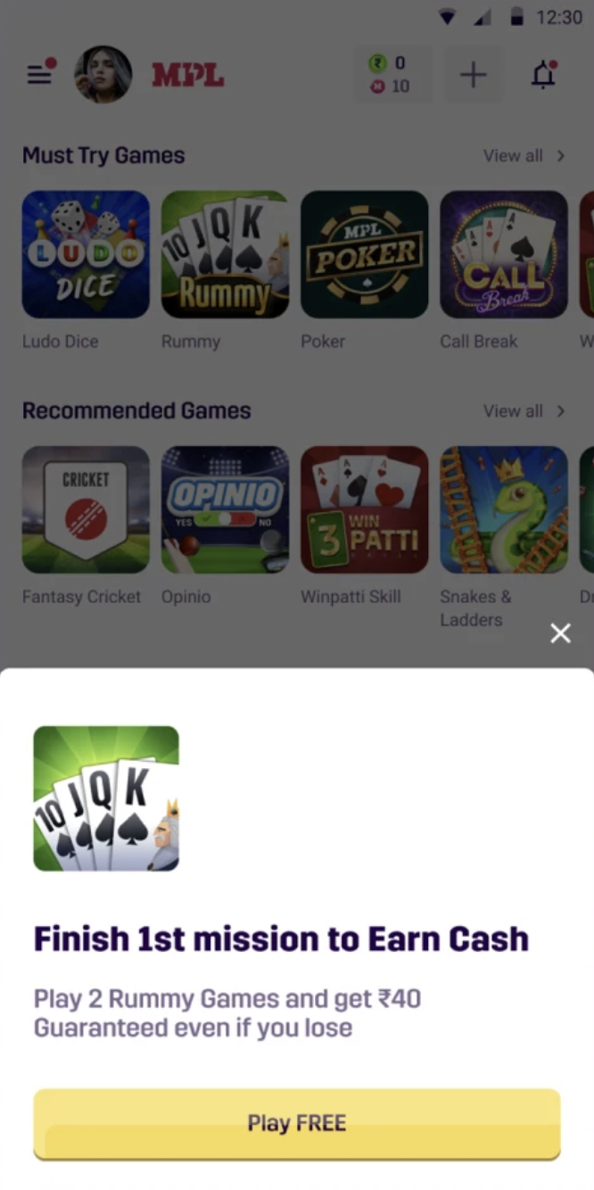 Mission prompt pushing a paid game before onboarding
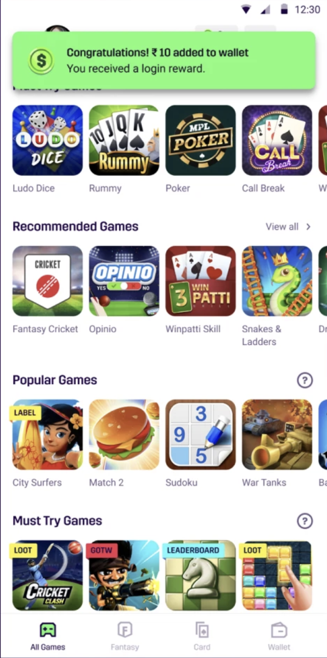 Login-reward toast dropping over the games list
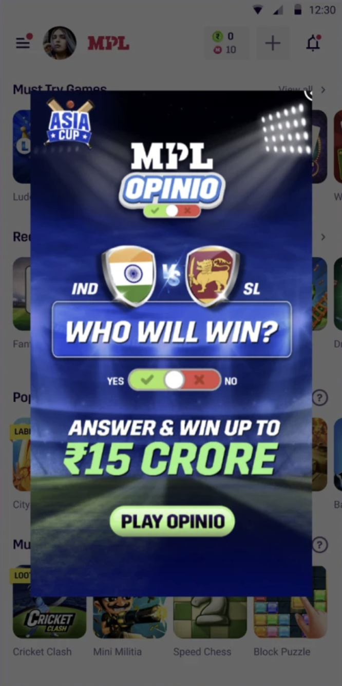 Full-screen Opinio ad blocking the entire feed
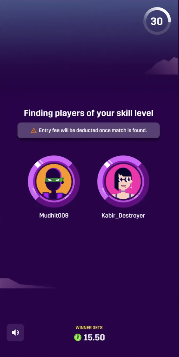
Insight 03
“Matchmaking” meant nothing to them
New users didn't understand what matchmaking was or why they were waiting—and a line about the entry fee being deducted only added anxiety at the exact moment they were asked to commit.
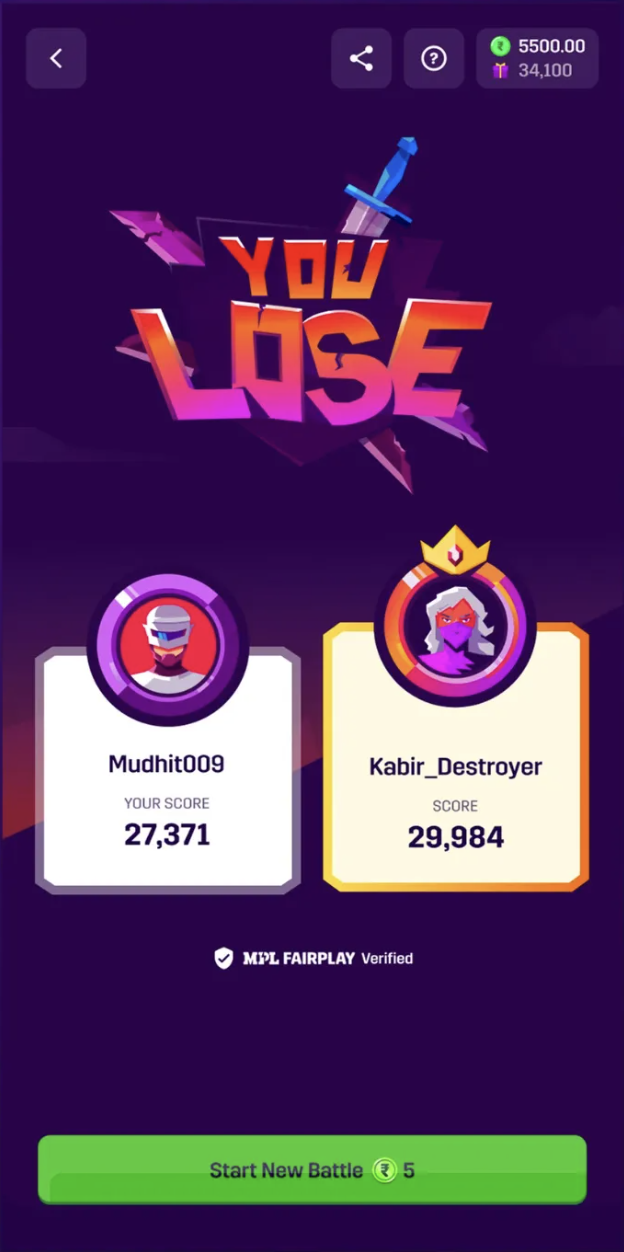
Insight 04
Unclear whether they'd actually won money
Users expected rewards, but scores and badges obscured the answer: did they win money?
More insights from the research
Users preferred promo credits over depositing their own money.
New players matched against veterans, then quit in frustration.
Selection surfaced nothing personalized or exciting.
23% hit freezes or crashes in their first session.
Mid-game drops meant lost progress and wasted entry fees.
The Core Question
How might we get new users to their first win in under 90 seconds?
04/Final Solution
Show the top 3 games in the first fold
Put the best games first, with one obvious next step.
Surface the first task with its prize money
Show the reward before the first tap, so the payoff is clear.
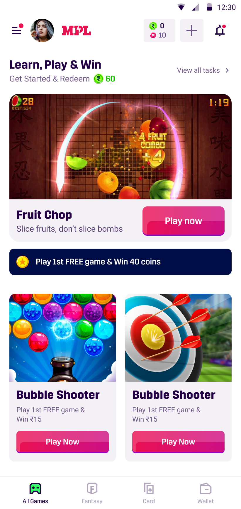
Reduced 12 menu options to 5 clear actions.
↓57%
Time to first action
↓63%
Navigation confusion
Preview gameplay before asking users to commit.
↑42%
Game selection confidence
↓34%
Early game abandonment
Step-by-step missions build confidence while users earn rewards.
↑68%
Tutorial completion rate
↑45%
User understanding
Five sequential missions. Each completed step pays out coins.
We invite the user into a quick, low-pressure game to get their hands on the product.
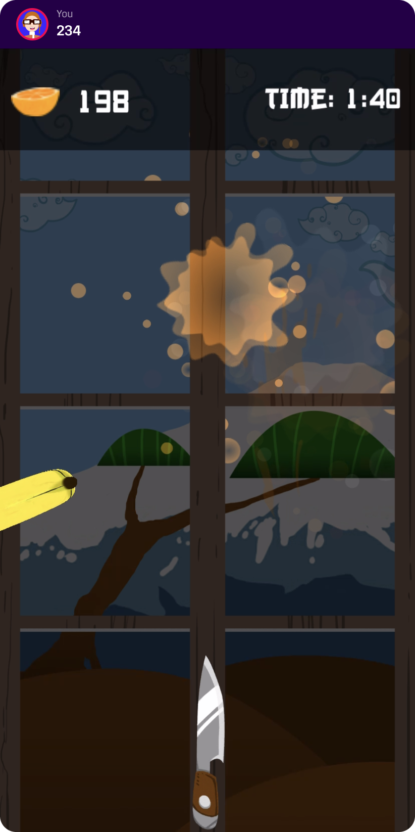
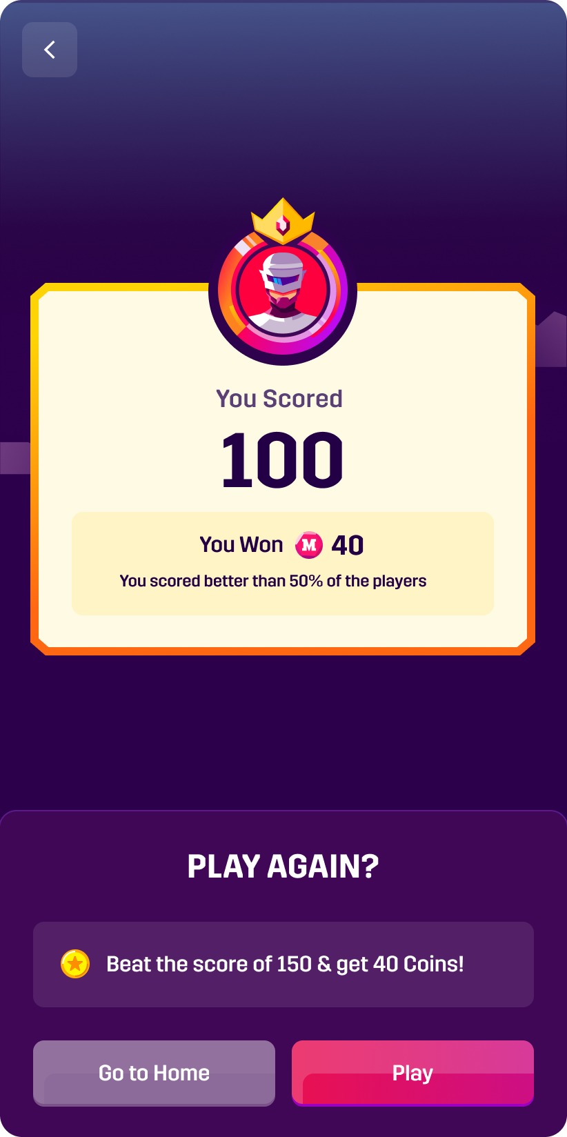
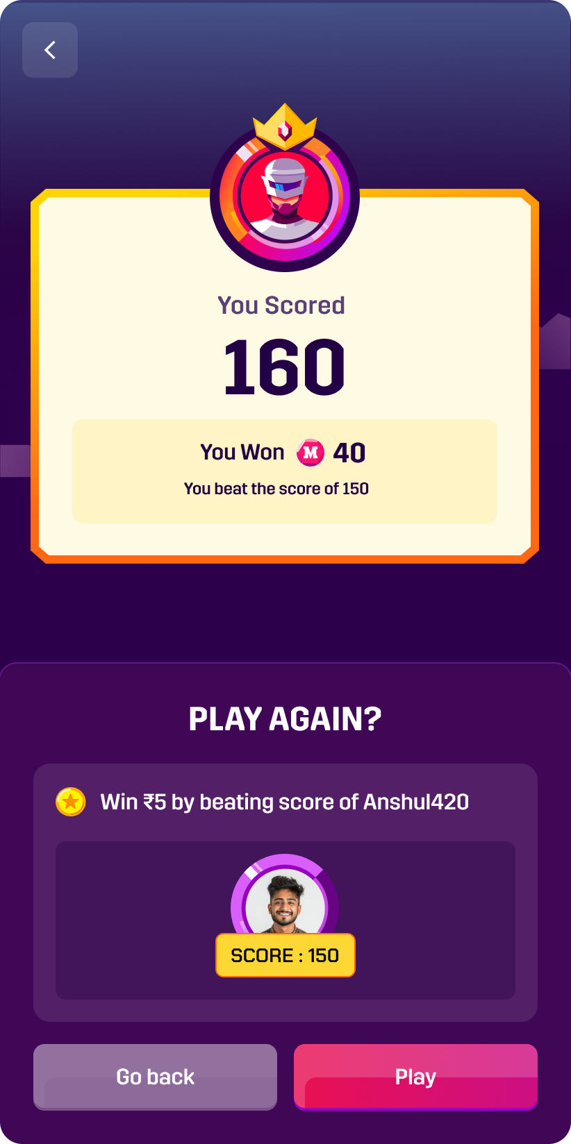
The user finishes the game and lands a score, creating a personal benchmark.
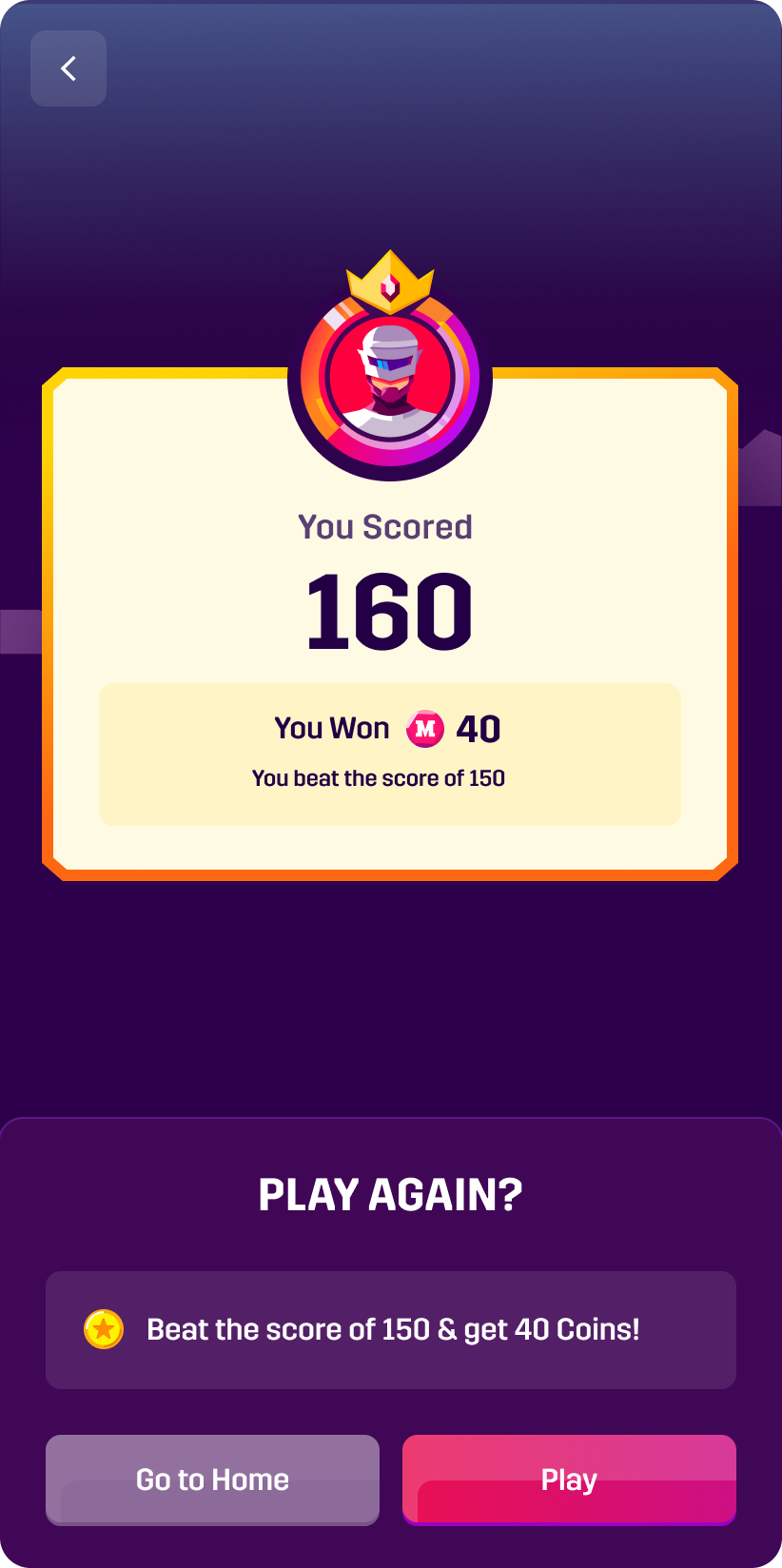
The next mission asks the user to top their previous best — competing only with themselves.
The user faces a computer rival tuned to feel like a real person, introducing head-to-head play.
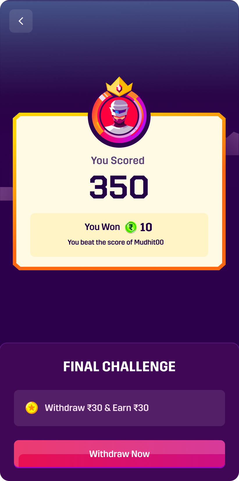
The loop closes: the user withdraws real winnings to their bank account and feels the full payoff.
A clearer path to value in under 90 seconds.
90 sec
To first game
One-tap sign-up with social authentication and personalized game recommendations based on user preferences.
5 steps
Down from 12
Features are introduced gradually as users need them, preventing cognitive overload during the initial experience.
98%
First-game win rate
The first game is designed to be winnable, with celebratory moments that build confidence and engagement.
03/User Interviews
New-player interviews revealed why the first hour was failing.
05/Impact & Metrics
Measured four weeks after launch.
49.6% → 29.8%
Day 7 metric
Onboarding flow
To first action
The improved experience drove significantly better user retention and engagement, contributing to increased DAU and revenue growth across the platform.
+47%
Increase in positive reviews
+31%
Higher engagement scores
Removing steps beat adding features—every time.
Analytics showed where; interviews showed why.
A/B tests overturned what the team assumed was obvious.
“The best onboarding experience doesn't feel like onboarding at all. It empowers users to discover value on their own terms, at their own pace.”